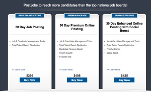
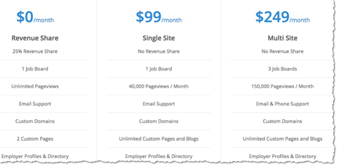
How you display your job board pricing can affect your sales. I see too many boards that hide this info and make it hard to read. When it comes to designing this page you have to make it public (don’t require registration to see pricing) and EASY to understand. Recruiters are BUSY people, don’t make them read too much information. As a general rule you should put your basic price point on your homepage as well.
DESIGN TIP: Below are a couple examples for how to display the pricing on your job board or for any online business that has 1-3 different price points. Make the info more visual. Create “information blocks”. Make it clear what you get for that price and make it clear what to do next (Buy).


We set up our job posting pricing page before re-launching in October 2014 much like what you suggested and our sales definitely increased. See https://www.CollegeRecruiter.com/pricing.
I disagree, however, that you want to display pricing from cheapest on the left to most expensive on the right. What we’ve found to work better after a fair amount of testing was to display the options in a way that would lead the buyer to purchase the package that we felt would provide them with the best value while also generating the most revenue per client in the long run. You’ll see on our page that the “best value” option is the largest and in the middle. The buyer can see that the cheapest packages don’t provide nearly as much value as the middle package we want them to buy and the most expensive packages are far more expensive than the middle package.
Excellent point Steve, highlighting the best value in the middle is definitely a must.