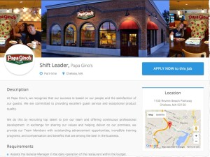
This is a great looking job description and it is the type of listing that I believe will be most prevalent on most job board and ATS systems in 5 years.

Here’s whats great about this job description which can be found on a new site called HigherMe.com.
1. Its visual. The top header contans ACTUAL photos of the employer’s location. Its shows where you will actually be working.
2. Logo. The employer logo is prominently placed on the page. Let your employers upload a logo for better branding.
3. Location. A map of the job loaction is on the right. I think every job listing should have a map. Location is a PRIMARY filter in the job seekers mindset when job hunting. This is an easy feature to implement with the Google maps API.
4. Two apply buttons. One on the top of page and one on the bottom. Don’t make the job seeker scroll too much. A top and bottom apply button is good web design.
But this is not a perfect job description in my opinion. There are still some important missing elements that would make it more appealing to candidates.
1. No social. There are no links or integration with the employers social media accounts. I think its important to integrate twitter feeds, etc into the page in a minimal way to give the job seeker more info.
2. Who it reports to. Job seekers want to know who they willbe working for. I’m talking about actual name of your potential boss.
3. Why work there. I think companies need to start telling job seekers why they should work there. They need to detail speicla perks/benefits that will attract job seekers.
4. No video. The pics are great but there should also be at least one video about the company. Bring the job listing to life. Give employers a way to embed a Youtube link on the page.
To be sure, the era of text only job listings is going away. Design is becoming more important as the web matures so you need to think of a job postings as a landing page that converts. Start giving employers a nicer way to display their jobs and you can stand out in a competitive job board world.


