I like job boards that make it easy to manage my jobs and candidates. As a recruiter my day to day job is filled from top to bottom so they easier you make my like the better.
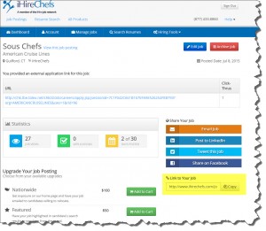
What does the management part of your site look like for employers? Its it user freiendly? Here’s an example of what I see as an employer on iHireChefs.com. There are some great features here that I’d like to point out.
(click to enlarge photo)
The image above is a look at the individual job description page for a Sous Chef. On this page are all the things I need to know or do as an employer.
1. The EDIT button and ARCHIVE buttons are different colors which make them easy to differentiate.
2. It clearly shows how many click thrus to my ATS the posting has generated (1) so far
3. The Statistics box shows me how many views it has generated.
4. The social media share buttons are right there to make it easy to promote on social.
5. They provide a handy “Copy Link” feature (in yellow) so I can share it on other sites.
6. I can easily upgrade my job if I want to through various options at the end.
I posted a job a month ago with them and actually got a follow up call from one of their reps which led to me posting another job. While on the phone he gave me a $45 discount which made my descision EASY. Its a great idea to follow up with your clients by phone just like he did as it will result in more business.
iHireChefs makes it easy to do business with them. I hope you can do the same for your clients.


