The look of job description pages across job boards and applicant tracking systems hasn’t changed much since jobs were online. They are generally full of text and way too long.
But I think its time for job publishers to come up with some new designs that make them more “scannable” for the web. I’m not talking about radical changes, rather ways to make the text more readable as people scroll through it on their phone or laptop.
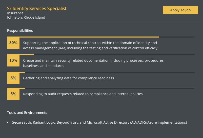
Recently I discovered one firm that takes a “lean” approach to posting their jobs online. CyberSN is a staffing firm for the cyber security industry. Their lean job postings are some of the shortest I have ever seen. Just look at how easy these are to read. They break down the job to the bare essentials and instead of bullet points use graphical percentages to break up the responsibilities.

And there is data to backup what they are doing. According to LinkedIn, job postings that are 300 words or less get 8.4% more applies.
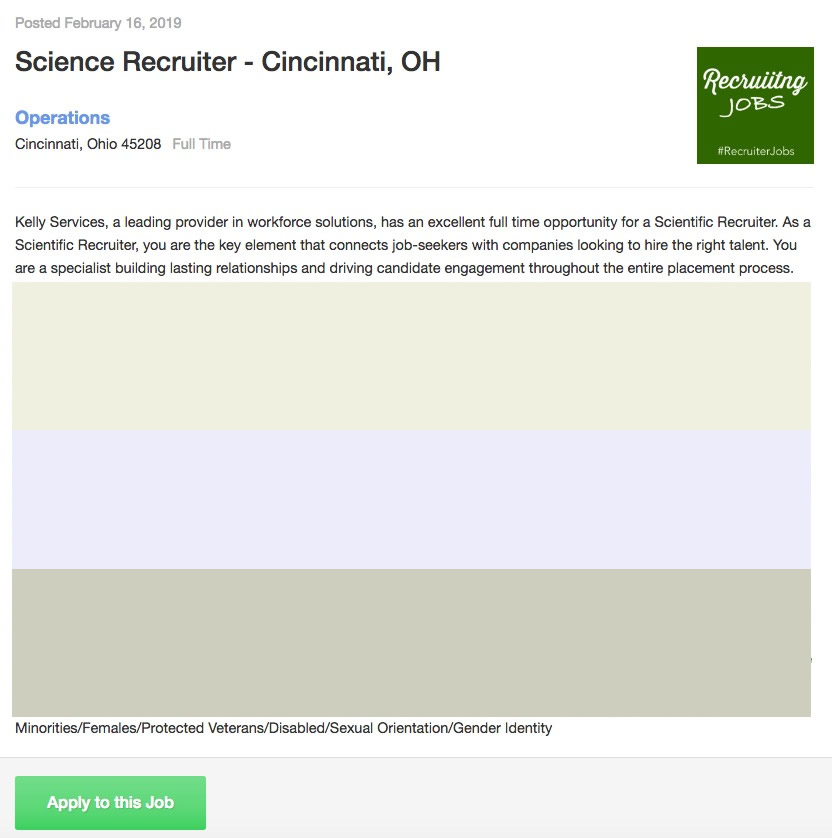
It makes sense. No one likes to read on the web so you have to display text in short bursts, that a user can quickly scan. I think job boards can learn from what CyberSN does. One idea would be to use light colored backgrounds to create box like elements that break a job description into scannable chunks like the example below. Horizontal lines are also a good way to do this.
It’s a visual web, do your users a favor and make your jobs more eye catching.


