As someone who reads a lot of press releases I cringe when I see bad PR being pimped online.
A press release should tell a unique story. It should avoid buzzwords. It should inform the reader. Unfortunately whoever wrote this piece for a new HR tech company called ShiftStars should be ashamed.
Let’s take a look.
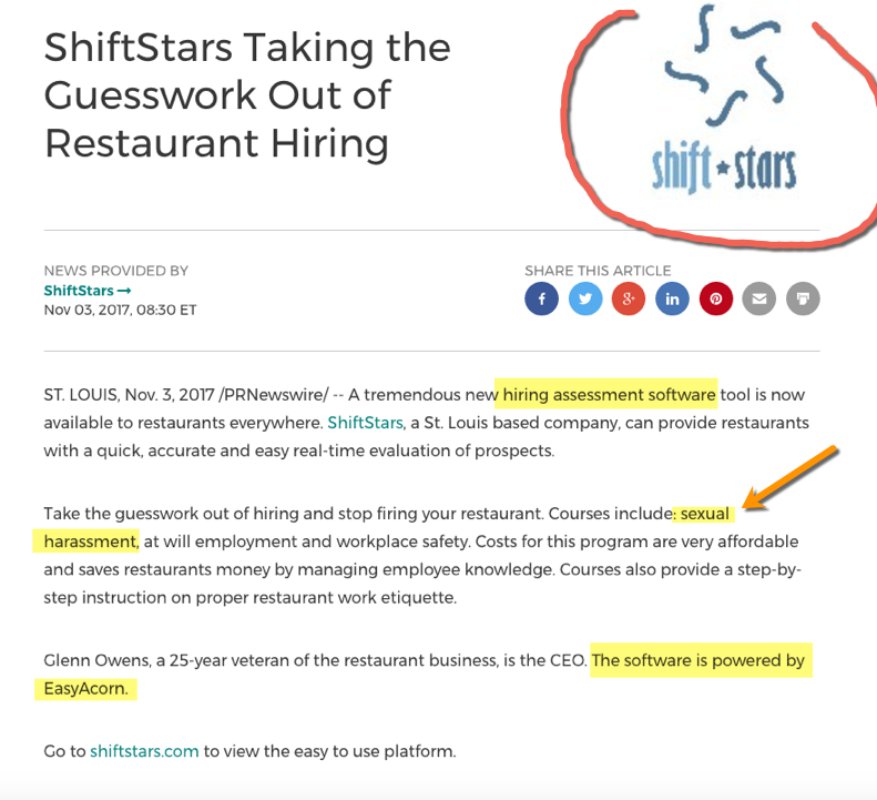
First, the logo is grainy and jagged. Never post a low quality image like this online, let alone in your press release. You need a high resolution version of your logo. Preferably 300 dpi. Their logo looks sloppy and amateurish.
So right off the bat they failed to present their new company in a positive light. Strike 1!
Next they use the phrase “A tremendous new….”. Really? Who will be impressed by this amateurish statement? No one, especially not busy HR executives who have heard of every ‘revolutionary’ tool under the sun. Strike 2!
Finally the content itself is literally non existent. I have never seen a two paragraph press release ever for a new HR tech product. In the first paragraph they tell you what it is, but the second paragraph completely falls apart after mentioning courses in sexual harassment. Wait, what? I thought this was a ‘hiring assessment software tool’?
Strike 3!
Whats even stranger is that this new tool is powered by something else! “The software is powered by EasyAcorn.”
Maybe I should just use them instead.
PS…if you need a press release written and distributed, consider hiring me 🙂 – ShifStars just wasted hundreds of dollars & learned that lesson the hard way.


