If you are about to code your own job board board rather than using an existing solution here are my basic guidelines to ensure you do it right. You need to think about serving 2 audiences—job seeker and employer. I hope you find these tips/examples useful.
a) Make it mobile friendly. Your site should render properly on any screen size.
b) Logo. Use simple clean logos that can be clearly ready on a mobile device.
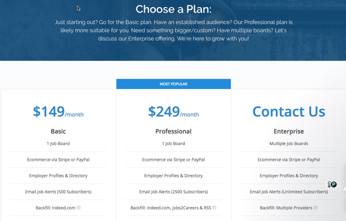
c) Pricing. Make your prices publicly viewable. Do not require registration to see them. Display your pricing in a simple horizontal layout like this;
d) Home page guidelines. First be sure the button/links to post a job are clearly marked and STAND OUT. Dedicate a minimum of 20% homepage real estate to employers. Here are 3 examples.
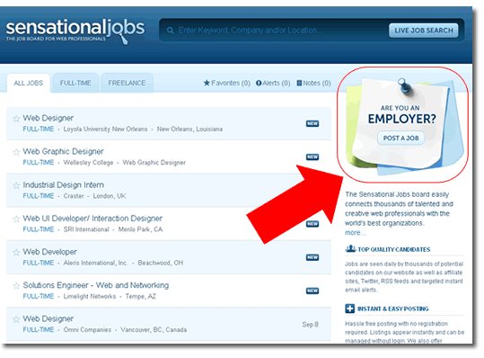
Love this post it note call out
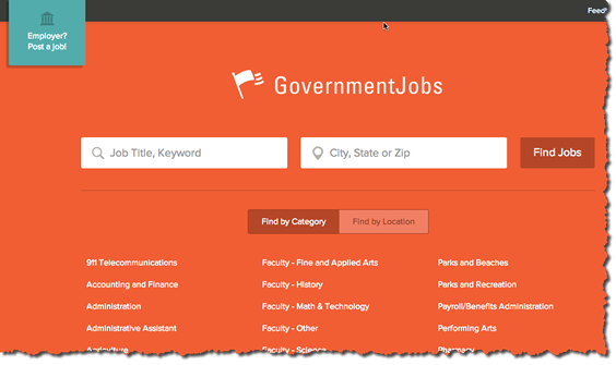
Governmentjobs.com has a simple button in the upper left.
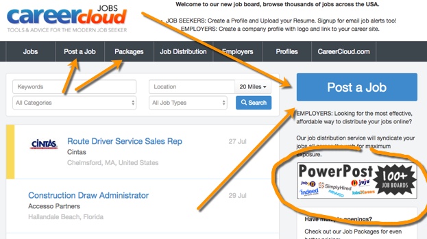
CareerCloud has several links, images and buttons that call out employers on its homepage. Note the use of logos for the job distribution service.
Also on your homepage display the latest 10 or 20 jobs from your site. And have a section where companies can be featured so you can upsell them this exposure.
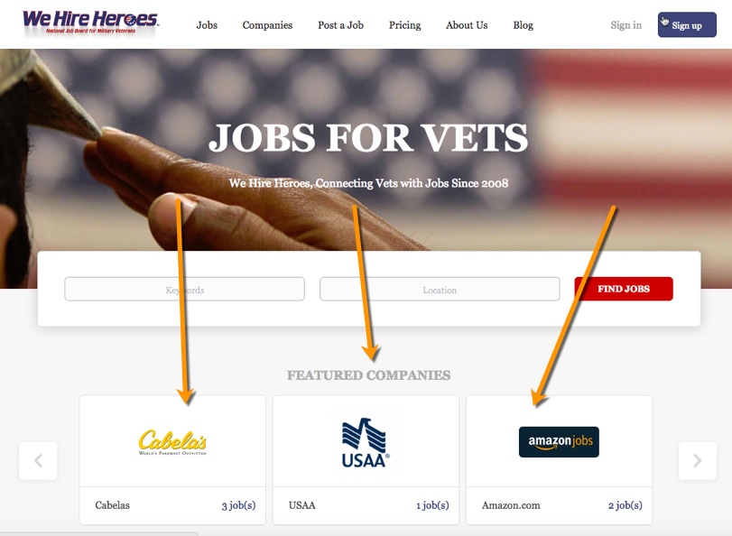
e) Job search box. This is the best way to let job seekers search.

f) Job Listing results. Let employers display logos on their listings so they can stand out more. If they don’t have a logo use a default icon in its place.
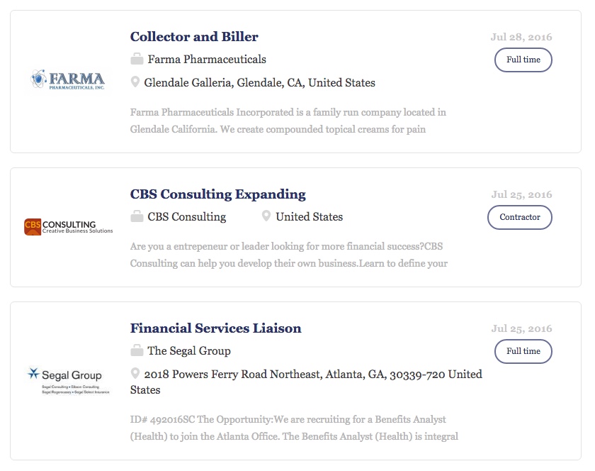
g) Job descriptions. The top section of your JD page should give a quick summary of the job basics for quick glance. This section should also lead with an <H1> header for SEO purposes. Put your location and company name in an <H2> just below it.
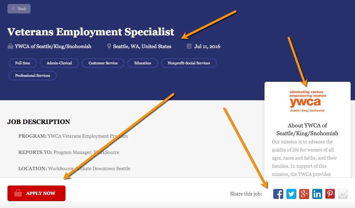
Also call out the company profile (with logo). The apply button should be clearly marked and their should be social media share buttons. See example below;
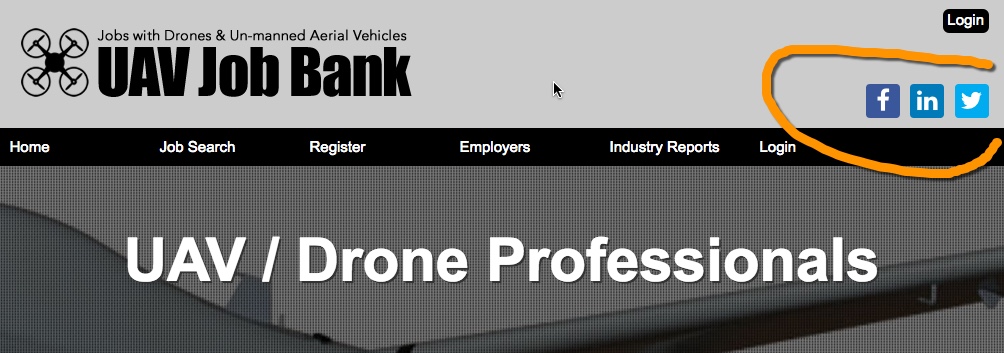
h) Social media. List your social media channel icons in your top header and in your footer.
i) Phone. If you have a phone number for sales, display it in your header and footer throughout the site.
j) Miscellaneous. Keep your design, simple and clean. If you belog to any associations like TA Tech, the Better Business Bureau, etc use those trusted logos in your footer which helps with credibility. Also on your checkout pages display all relevant credit card logos. Also if you have been in business for more than 5 years show that because it helps with your credibility.
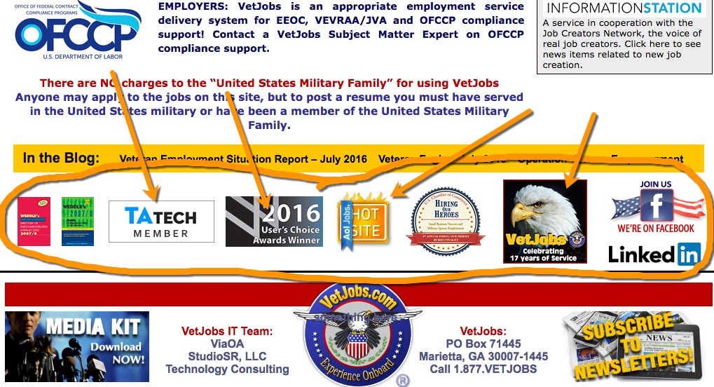
Vetjobs.com footer with badges adds credibility
