Design plays a key role in the success of your job board. Well designed sites make it easier for customers to “trust” doing business with you. A client recently asked me which job boards have the best designs so here are three such sites that came to mind. Got other suggestions? Leave a comment.
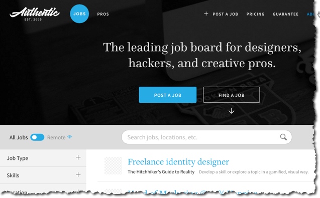
1. AuthenticJobs.com for designers/hackers. It has a clean black/blue/gray color scheme, features a responsive site design that looks equally great on mobile. Homepage displays most recent listings with logos.
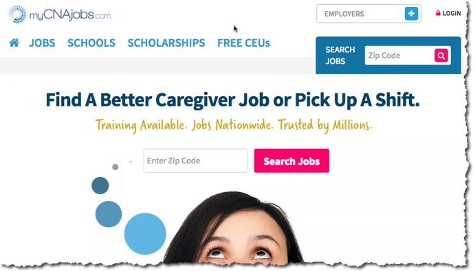
2. MyCNAjobs.com for caregivers. I love the simple zip code search box. As a niche site there really isn’t a need to use keywords. Nice logo, big lettering and imagery make it great to look at.
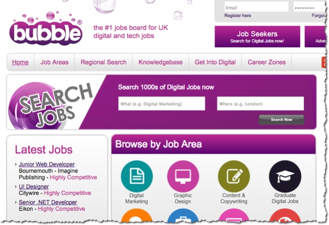
3. BubbleJobs.co.uk – Though its a more traditional job board design, the color scheme really draws you in to this tech job board based in the UK. Yes its a “busy” homepage but it’s just really well done. The bubbles background image offers a nice touch. I like the icons for diving into job categories.
