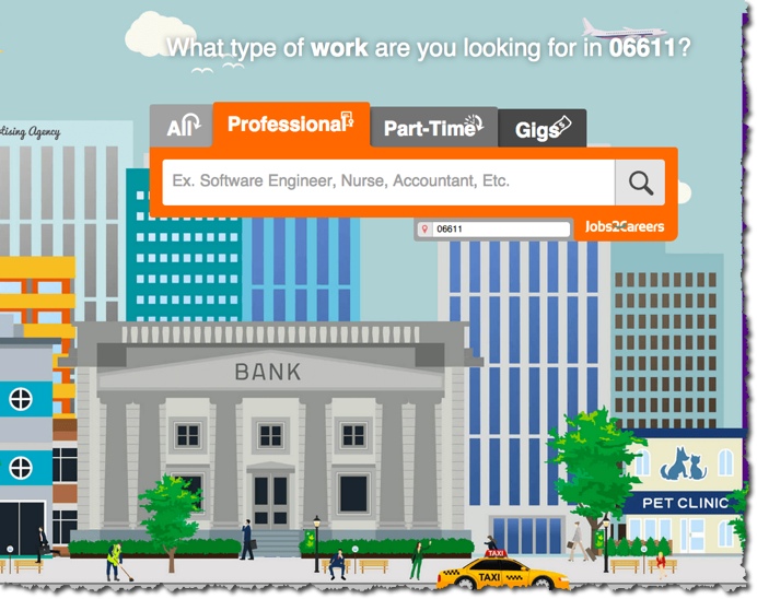
The team at Jobs2Careers has come out with a very visual interface for its homepage, something quite different from the usual job board designs I see.
There are two things to note here. The first is that the background design changes based on which tab you click. The second is the tabs themselves.
The backgrounds really give the site some personality. Most job board designs tend to lack creativity in this area so I give J2C some credit for this unique design concept. Since the web is more about visuals now anyway, this is a good way to differentiate their user experience.
The tabs are interesting too. They’ve essentially created 3 job boards in one. Professional jobs, part-time roles and “gigs” like baby sitting and dogwalking. Its a unique concept that I have not seen before. The part-time tab seems especially relevant since a lot of people like to have a 2nd job at times.
TAKEAWAY: Design is imporant for any web site. For job boards its particularly important since a poor design WILL affect your sales negatively. The better design, the more you’ll make.


