

Jobs2Careers, a pay per applicant job aggregator has been on a roll lately. They were named to the Inc.com list of fastest growing companies (2014) and they’re about to move into brand new offices in Austin Texas. I gave their site a look the other day and was highly impressed by its design, and UI.
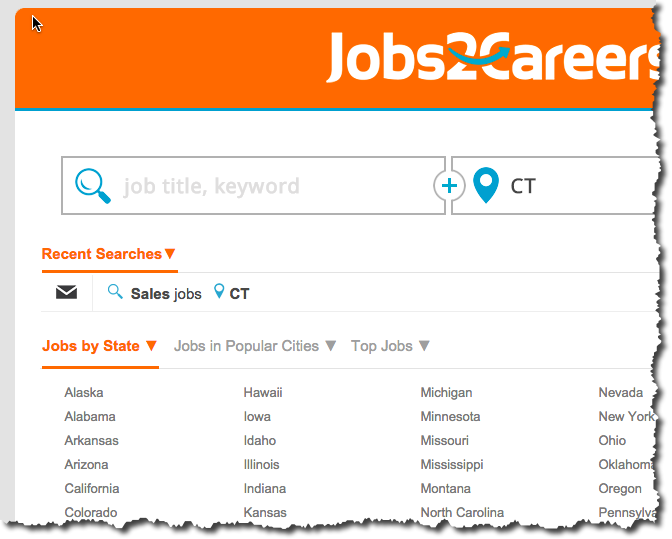
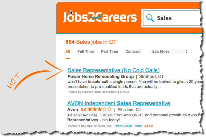
There’s a lot to like about how they have constructed the job search experience. The site has a sharp, clean design with a strong color palette and they make the states browsable up front via the home page. If I was building a site today from the ground up, I’d emulate their design direction in a heartbeat. It’s simple, strong and effective. That lets the job seeker accomplish their task with minimal effort.
Here are some other aspects of the site that stand out to me.
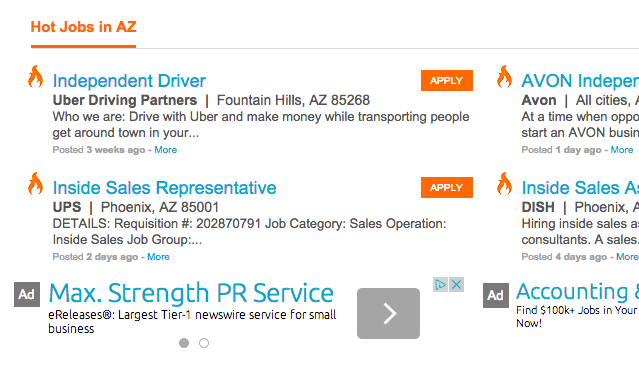
They also do a great job integrating Adsense into the site content.
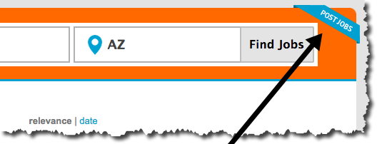
And their Post a Job icon is clearly visible on all pages throughout the site.
Thanks for the shout out Chris! We appreciate the compliments and will continue to impress with design!
-Shelly