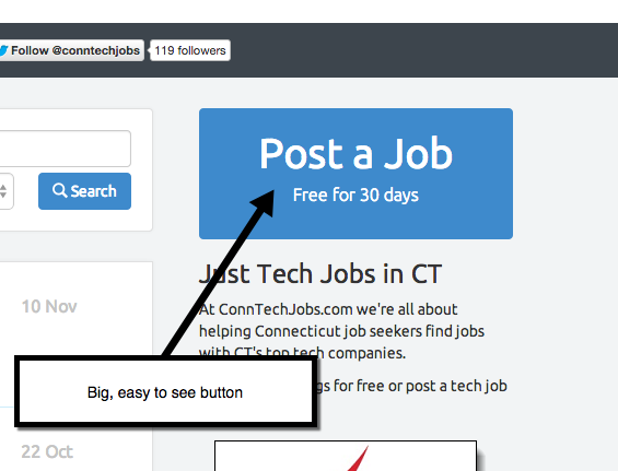
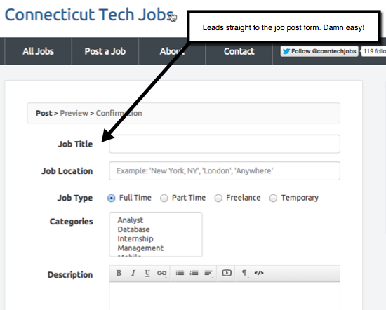
Does your job board or Applicant Tracking Software have a long drawn out apply process? Well if it does you need to change it ASAP. I came across an article recently that talks about how USAjobs.gov‘s apply process is hurting applicants.
USAJobs.gov, the main job site for federal employment, has discouraged applicants for years, with its lengthy résumé requirements and voluminous questions. Applicants complain that they apply for open positions only to hear nothing from the agency that posted the job. They also say that getting through the process is based less on talent and more on how well they tailor their résumé to keywords in the job listing.
When you put barriers in front of a web site user (no matter what task they are trying to complete) you slow down what they want to accomplish. I hate barriers like this. The web is about SPEED! Get out of the user’s way. Dont make them register to see jobs or pricing. Tell them exactly what to expect when you lead them down a path. Help them accomplish their task with ease.
More job boards/ATS need to streamline their site and make them simpler to use. Thats why I like Jobboard.io so much. Its dead simple to use from a job seeker or employer viewpoint. From an ATS standpoint services like SmartRecruiters and TheResumator also have simple, easy to apply for job apply functions.
Simplicity is the new killer app! -Chris Russell

No registration makes it easy to post. This leads to MORE postings, not less.


