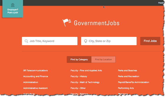
A relative of mine was job hunting and came across Governmentjobs.com and showed it to me. I was immediately struck by the simplicity of the design. Its a minimalist’s dream design.
I love the placement of the Employer callout, cant miss it. The simple flat design is clean and familiar. According the the company info page the site has been around since 1998 and was born out of an ATS called NEOGOV for states and cities.
The search results page is equally clean with only Adsense ads on the top and bottom of results. As I look at the site it almost seems TOO clean and devoid of more design elements. But it is a rather inviting look and feel that the rest of us can learn from.


