Simplicity in job board design is important. Your goal should always be to help employers post jobs quickly and easily OR help job seekers get to the jobs they seek with little effort. When I came upon CMShires.com the other day I was both elated and saddened at the same time.
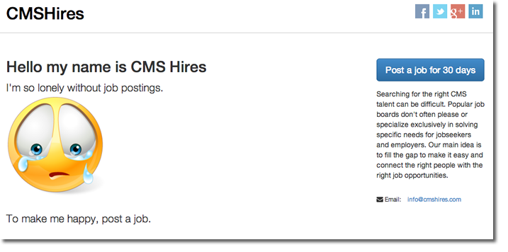
I was elated for their attempt at simplicity on their homepage but its certainly not the perfect page. I like the niche, I like the ‘post a job’ callout, but where is the rest of the site? How do I search jobs? They are missing the most important thing on the homepage, …actual jobs!
The post a job form is simple and sleek and I like the tongue in cheek message about being sad. But they either haven’t finished the site or they don’t get job boards.
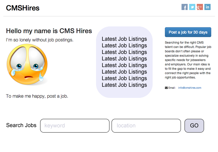
If I were to finish this site I’d add the latest postings in the middle and put the job search form horizontally below the top 3 columns. With a little effort this could be a nice job board. And once a user posts a job, they should show a happy face on the thank you page to carry over that theme.


