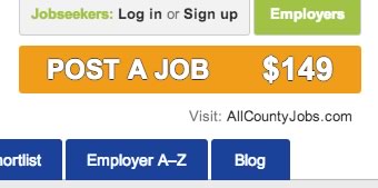
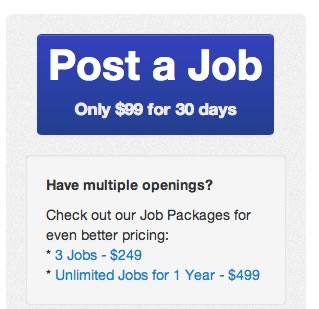
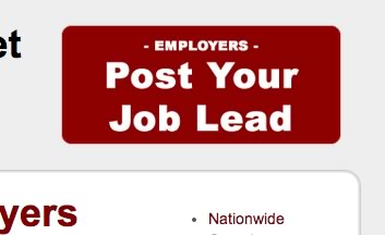
I have said in the past that your job board design needs to explicity call out employers to post jobs. You MUST make it clear and easy for them to see where to go and how much it costs. That means at least 20% of your homepage real estate needs to have messaging for employers. Part of that means BIG COLORFUL JOB POST buttons. Below are 3 examples of what they should look like. If your job site does not have these in place you are LOSING money!
