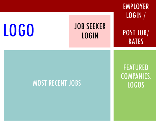
I’m currently assisting a client to re-evaluate their job boards and suggest some usability and design improvements. It got me thinking about the ideal layout for a job board homepage. The ideal homepage has certain elements, each with a dedicated space that must be “above the fold” so they are visible on the screen. Take a look at the image below.
The first thing that should stand out is for employers. They should know immediately where to go to post a job or login. Since employers generate the revenue the homepage callout to them is very important. The homepage should also list the most recent jobs. This shows both employers and job seekers whats new as well as bringing credibility to your site. The job seeker login is less important than the employer version so give it slightly less space. Logos of featured employers are also good for business.
If you are designing a job board from scratch this is a good template to guide you.


